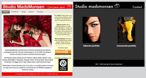
Sometimes a make over can be a good thing. The old website had served its purpose well, but it did not reflect our latest work. The first site was built out of need and within a very short time frame. I had left my art director job after six years and was now about to embark on a new adventure by opening up a commercial photography studio. I built the first site the “old school” way, with frames and tables, had no time to learn enough about css. The portfolio took the longest time to organise. It was divided into two sections, commercial work and editorial work. Very simple, but that was all the work I managed to present at that point. A simple contact button in the corner lead to a contact page with an image of our studio as well as contact details. Our online presence was ready. We were open for business.
I always knew that at some point I would need to update the site and for that, quite a few coffee breaks at cafe’s with pen and paper was needed. Yes, pen and paper. Design the old fashioned way. Prior to the design phase I had spent quite some time online doing research. I found various offerings for photographers, but most of the time, it involved flash based systems and they are slow to load here in Vietnam. The last thing I want is a potential client to give up due to excessive loading speed. I knew I needed something without the use of flash and built by using css and not by frames. By setting myself goals, I could get a better understanding of the design requirements.
With the research done, then it was time to start the design phase, sketching out layouts on paper, modifying the design by crossing over items. When it got too messy, re-draw the page again and then continue. Sounds tedious you may say, but not as tedious as it would be by trying to sketch on the computer. I can go through ideas faster on paper than on the screen. Once you get behind the keyboard, you easily start spending more time tweaking the design instead of working rapidly through rough ideas. Hence the paper and pen approach first. It actually saves time.
Once I had created the blueprint, I spent 2 days averaging 17-18 hours each to build the whole new site. A professional web designer could probably create it in less time, but then I would not have the creative challenge and satisfaction of building something from scratch. Disclaimer one, I did have a professional web designer friend of mine check the code afterwards and he helped to install the contact form. Disclaimer two, the company that hired me in the first place to come to Vietnam did also web development and I ended up working as a project manager on some of the web projects so I am familiar with Dreamweaver and html.
I have always believed it is better to make use of existing services than trying to recreate the wheel, especially when it comes to anything internet related. I have experienced first hand the efforts going into software development and I do not have the time nor the resources to do something advanced as that. My passion stays with photography. That’s where I want to spend my time. I really do like what Modernista does for their corporate website. It is not for any company, but they embrace the idea of using the net to the fullest.
The new site continues using Issuu for portfolio presentation and links to our frequently used online social networking sites are displayed under the about section and a Facebook fan button has been added to the contact section.
However, the most important difference from the first to the second site is the portfolio section itself. Over one year and a half our studio have managed to build up a substantial amount of work and we have now divided into 8 portfolio sections instead of the previous 2. A big thank you to all our clients who have made this journey possible. It’s been a great year and a half and I truly believe this year of the Tiger will be equally good.


Well, good luck on the new layout. Looks good.