
Advertising for Nia Bella ice cream store. Photography & design by Studio MadsMonsen.
A combo is better than a single strike. I realised that when playing karate kid arcade games. The combo move was always better than the single kick or punch. Advertising agencies often have an art director/copy writer team. A killer combo of visuals and words. They realise that the team can be more creative than an individual.
Starting out as an apprentice, I realised the perception amongst my peers was to get a “proper” photography degree if you wanted to succeed as a commercial photographer. An apprenticeship was ranked lower. When I started on a photography degree course, I realised that I would spend my time and money on something I already knew very well. I still remember my evaluation meeting with the head of photography department where I raised my concerns and realised that the only thing they had taught me was a split toning technique for black and white printing. I realised that I was in the wrong place.
I asked my graphic design tutor, as we had a weekly two hour graphic design class as part of the course, which school she would recommend for me to apply to, as graphic design was something new and it had caught my interest. I received a list of names, some I heard of, some I hadn’t. Then I asked about a school that I had a friend of mine attending. She looked at me and then told me flatly to forget about that one, I would never get accepted there, it was out of my league.
I could have listened to her, but then I would not be where I am today. I realised that nothing is impossible if you really want to achieve it. I managed to arrange a meeting with the other school. I was given a chance. I got accepted. I still remember the expression of her face when I told her that I got accepted at Central Saint Martin’s College of Art & Design. Gobsmacked is an understatement.
Graphic design and photography. That is a good combination. I am grateful that I ended up with what Isaiah Brookshire calls a +1 skills combo.
Those skills are handy when your business partner propose that you invest and start up an ice cream brand.
Naming a business is similar to naming a child. Being a parent I already know how time consuming that process can be. On the other hand, a very tight deadline puts the brain in creative hyper drive and delivers faster than mother nature. Thus, Nia Bella was born. Prematurely? Maybe, born nonetheless and screaming for a logo. Time for a coffee break. Armed with a Artline pen and a drawing pad, various options were tested and discarded until one was deemed worthy of exploring.
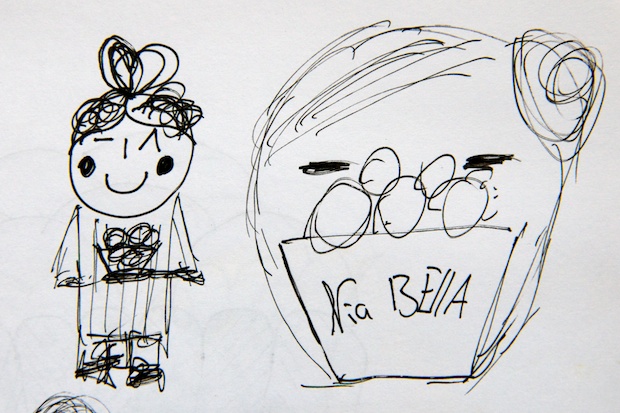
Concept drawing. Giving a gift and cartoon cuteness galore.
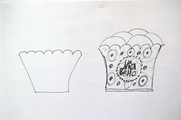
Concept drawing. Deciding on shape, working on element options.
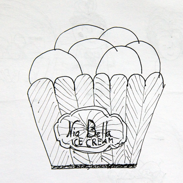
Concept drawing. Final route to explore further.
Only when I had a direction worth exploring, it was time to put to use an iPad application that another graphic designer introduced me to, Paper. I realised that it eased up the colour exploration and design process tremendously. Once the overall look and feel of the logo had been achieved I could email myself the result.
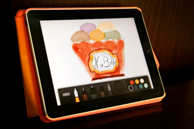
Paper in action.
Only then it was time to start Illustrator and do a refined vector version as seen implemented on the business card image.

Nia Bella business card.
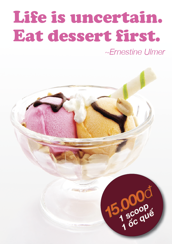
Now it’s time to enjoy a scoop of ice cream, that I just realised. As our slogan says: “Life is uncertain. Eat dessert first.”